
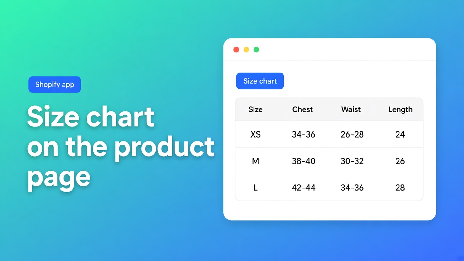
Shopify size chart app: measurement tables on the product page, popup or inline
A Shopify size chart app is not another Size variant. Small / Medium / Large is inventory. Shoppers still need the grid: chest, waist, EU versus US, how to measure inseam. Without those numbers they guess, or they leave the product page for a size-guide URL three clicks from Add to cart. Returns follow the wrong fit, not the wrong colour.
This piece covers what native Shopify actually gives you, the workarounds merchants paste into descriptions and menus, and how OO - Advanced Table Builder puts a size chart on the product page as a popup trigger or as plain content. App Store name: OO - Advanced Table Builder. Docs still say Tables, Specs & Comparisons in places. The CTA is always that listing URL.
Shopify stores the size SKU, not the centimetres
Adding variants treats Size as one of three product options. You get a picker. You do not get a “92–96 cm chest” column, a measurement diagram, or a second grid for women’s fittings. The option selects the variant; it does not explain the garment.
What shops usually add instead:
an HTML table in the product description, below the fold with care notes;
a page titled Size guide, parked in the footer;
theme-specific size-guide sections or metafields that vanish when you switch themes.
None of that is “measurement table beside the buy button, scoped per product, popup or inline, without writing Liquid.” Online Store 2.0 app blocks can host an app; you still need somewhere to build the chart.
What stores try today
A table in the description. Chest / Waist / Length under the gallery. On a phone it sits below reviews. No popup trigger. Two fittings (men / women) become one unreadable grid.
One size-guide page. Fine if every hoodie shares one fit. Breaks when trousers use another scale. Leaving the product page to look up a size is a drop-off; many pick Medium and hope.
A supplier PDF in product media. Unreadable on a phone, not translatable per locale. A collection refresh means swapping images by hand.
Custom Liquid. Works until the next theme update. No visual builder, no draft from a screenshot of the chart you already have.
None of those paths give you a Size chart type with popup or plain chrome, separate chart blocks, and placement as a theme block or automatically above Add to cart.
Listing facts, then the size-chart docs
OO - Advanced Table Builder is Free on the App Store (18 September 2026: Free, 0 reviews, launched 17 September 2026). Admin UI is English. Works with: AI, Excel, Google Sheets.
Listing: size charts, product specs, comparison tables, tabbed content, and Us vs Them. Visual editor or an AI draft from a description or screenshot. Connect metafields, style the table, place it on products and pages, translate customer-facing text.
This article is the size chart path. Other types in the same app get their own posts. Do not assume Specs inject next to Add to cart — auto-placement rules: Specs use the Product specs theme block only. No ATC auto-inject for Specs.
Size chart type
Size charts are measurement tables so shoppers can find their fit. You stack text, table, and image blocks in one Size chart. Keep Men / Women (or any extra grids) as separate table blocks instead of merging them.
Structure:
open the table → Structure;
add blocks and drag to reorder;
edit cells in full screen;
choose whether sizes run as the first column or the first row.
Design:
Display mode — popup trigger or plain content;
trigger label, colours, fonts, table surface.
Storefront:
add the Size chart theme app block, or
turn on the app embed so matching enabled Size charts can render above Add to cart when the product template has no Size chart block.
Same article’s tip: upload a measurement diagram as an image block above the table so Chest / Waist / Length are not abstract labels.
Popup versus plain is a Design setting
Design settings overview: for size charts, popup vs plain, trigger, table colours. A popup keeps the product page short — a “Size chart” control next to the variant picker, grid in an overlay. Plain content inlines the table in the template. Use that when the chart is small or when shoppers ignore the trigger.
Same Size chart: flip Display mode. Structure stays; Design changes the chrome.
Place the block; treat auto-placement as the fallback
Place tables with theme blocks: Online Store → Themes → Customize → product template → Add block → Apps → Size chart. Docs recommend sitting it near price / buy buttons. The Size chart block is visibility-based (which charts show comes from Settings). Tabbed and Us vs Them blocks pick a specific table ID instead.
Enable the app embed: Theme settings → App embeds → Tables, Specs & Comparisons. Without the embed you lose Size chart auto-placement above Add to cart, shortcodes, and the comparison tray/modal used by other types. Theme blocks alone are not enough for those runtimes.
Auto-placement again: embed on and no Size chart block on the template → enabled Size charts that match product visibility may render above Add to cart. If the block is present, the block wins.
Shortcodes are optional (docs): `[oo-table id=YOUR_TABLE_ID]`, embed on, table enabled. Prefer theme blocks or auto-placement on a product template.
Disabled tables do not render
Enable, visibility, and products: if Enable is off, the storefront stays empty even with a block in the theme. Size charts (also Specs and Comparison) support:
All products — wherever placement applies;
Selected products only — only the products you pick (on product pages).
That is how a hoodie chart stays off socks without a second theme. The internal description field is admin-only.
Walkthrough: one hoodie, two fittings
One hoodie product. Variants: Size (XS–XL) and Colour. Two measurement grids.
Install from the listing. You land on the Dashboard.
Create table. Pick Size chart, or Generate with AI: a short description plus a screenshot of the chart you already use (PNG, JPEG, WebP, or GIF, max 4 MB). Create and refine tables with AI: AI picks a type, fills sample structure, and can split multiple charts in one photo (Men + Women) into separate blocks. Review Structure before you trust it. AI is a draft.
Structure: image block with the how-to-measure diagram; table block Men (sizes in the first column); table block Women. Do not build one eight-column spreadsheet.
Design: popup, trigger “Size chart”, colours close to the theme. Optional: Refine Design with a website URL for brand colours/fonts; structure stays as-is after confirm.
Settings: Enable. Product visibility = selected → that hoodie (and the rest of the same fit if you want).
Theme: app embed on. Add the Size chart block above Add to cart on Default product, or leave the block off and verify auto-placement.
Private window: open the trigger, both charts, mobile width. Translations of customer-facing strings live in Settings later — out of scope here.
Listing Works with includes Excel and Google Sheets. Use a sheet if the centimetres already live there; still keep Men/Women as separate blocks.
Start checklist
Open OO - Advanced Table Builder — Free on the listing.
Follow Quick start: Create table → Size chart (scratch or AI) → Structure → Design → Enable and visibility → embed plus block, or auto-placement.
Try popup; switch to plain if the chart is short.
Keep extra fittings as extra table blocks.
Do not expect Specs to auto-inject beside Add to cart.
Wrap-up
A Shopify size chart app should put centimetres next to the purchase decision, not in a PDF three pages away. Native Shopify stops at the Size variant. OO - Advanced Table Builder adds the measurement table: popup or inline, multiple charts, theme block or auto above Add to cart.
Install it, ship one hoodie chart, and check that the trigger is still visible when the variant picker is open. Then attach the next products with visibility rules.

Custom webshops, websites, and applications combined with smart online marketing to help your business grow online!


Reviews
5/5
Mail: info@onlineorigins.nl
Tel: 073 234 0612
KVK: 89825624
BTW: NL865123639B01
Bruistensingel 500,5232 AH 's-Hertogenbosch Cookies
© 2026 Online Origins