
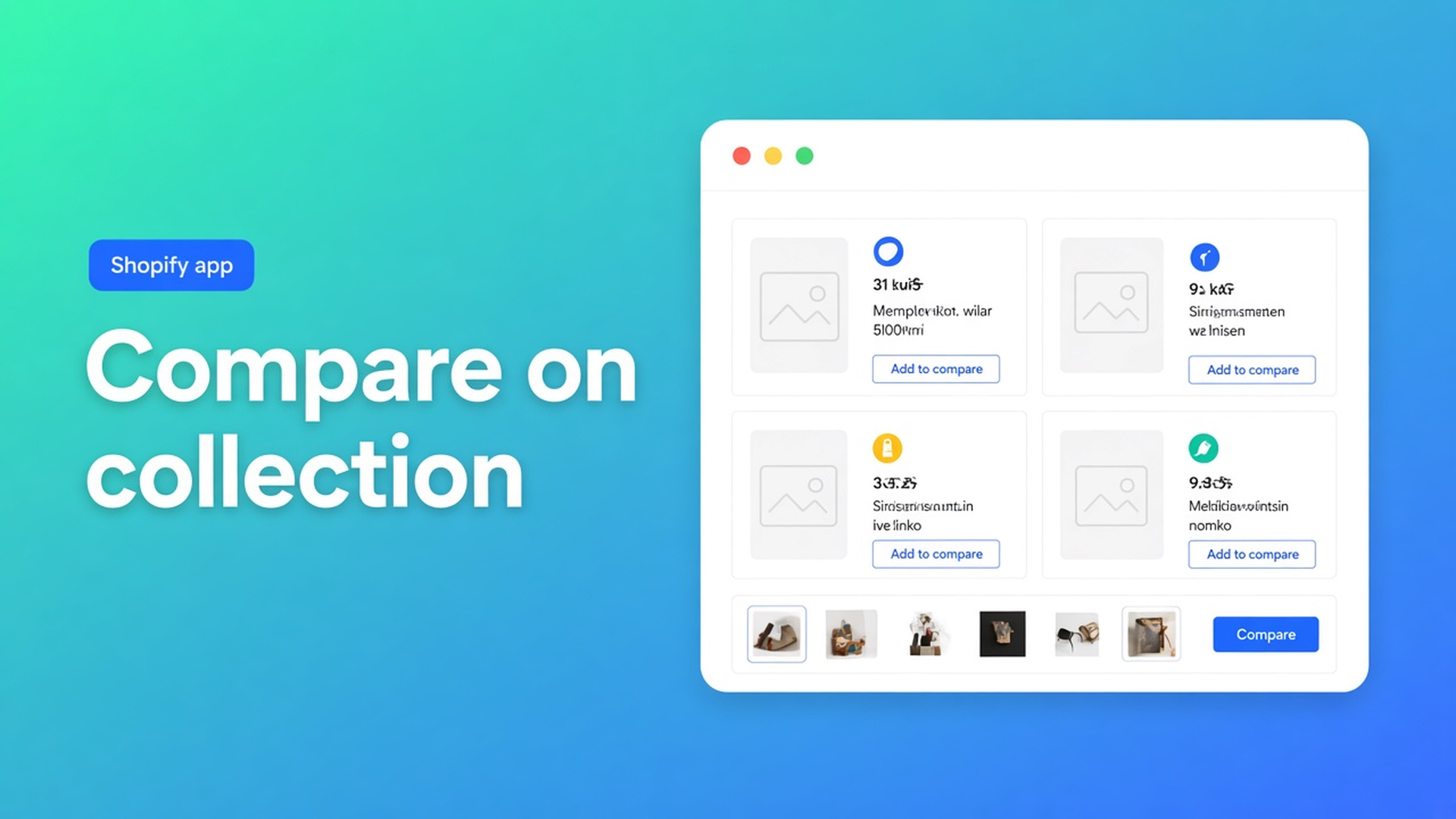
Shopify add to compare on collection cards: grid first, then the tray
The shopper is on `/collections/espresso` with twelve cards. Mini, Pro, Max. Three tabs open, three product pages, nothing side by side. Shopify add to compare on collection cards should start on that card — Add to compare, tray, then the modal — not after someone has read five PDPs.
This article is about *where* the button lands: on collection/product cards, or as an inject under the price when the Compare block is missing. The comparison type itself (rows, metafields, tray) is in Shopify product comparison table. Here the collection is the subject. The CTA stays OO - Advanced Table Builder (docs sometimes still say Tables, Specs & Comparisons).
Do not pitch another Online Origins app. Specs do not inject next to Add to cart. Naming competitors to tear them down belongs nowhere.
The Shopify problem: collections are grids, not a comparison
Shopify Help Collections is how you group products. Cards show image, title, price. Filters and search narrow the set. What is missing: the shopper ticks Mini and Pro *in the grid* and opens one table.
What merchants actually ship:
a page “Compare our range” with last season’s screenshot;
“see specs” that opens three PDPs;
an HTML table in the collection description that goes stale when wattage changes.
Theme app blocks solve *where*: you can drop an app block on a collection template. Someone still has to build the Comparison type, set visibility, and run the tray. Without a button on the card, compare stays a PDP chore.
What merchants try instead
A button only on the product page, collection left as-is. The shopper has already left Mini before Pro is in view. Compare starts too late.
Liquid on the collection card that prints two `all_products` side by side. Breaks on the next theme update. No tray, no per-locale strings.
Us vs Them on the collection as “us versus the market”. Different type: feature rows, yes/no/text, picked in the block by table ID. Not a live multi-product picker from cards.
Expecting the Specs block on the collection to act as Add to compare. Auto-placement rules: Specs use the Product specs theme block only. There is no Add-to-cart auto inject. Do not claim otherwise.
None of those paths is: Comparison enabled, app embed on, Show on product cards and/or a Compare block on the collection template.
How Add to compare on cards works
OO - Advanced Table Builder is Free. Listing: 5.0 (1 review). Launched 17 September 2026. UI in English. Works with: AI, Excel, Google Sheets. The listing names comparison tables, multi-product, highlight differences, and placing tables on products, pages, or anywhere else.
This is the Comparison path. Size charts can sit above Add to cart when the Size chart block is missing. Tabbed and Us vs Them always go through their block (specific table ID) or a shortcode.
Build the table first (Quick start): Create table → type Comparison (or Generate with AI, screenshot max 4 MB). Structure: rows from Shopify-backed modules and metafields. After AI: map Weight/Price/options to Shopify modules, not frozen custom attributes. Settings: Enable. Visibility: All products or Selected products only — selected-product rules apply on product pages; on non-product templates, behaviour follows the block/visibility helpers in the theme (Enable, visibility, and products). Disabled tables render nowhere, including cards.
Two controls, two surfaces
Comparison placement options in Settings:
Auto-inject under price — when the Compare button theme block is not used, place Add to compare under the price via the app embed.
Show on product cards — also show Add to compare on collection/product card grids where supported.
Always keep the app embed on so the tray and comparison modal work. Without the embed there is no runtime, even if a button appears to sit on the card.
Place tables with theme blocks: blocks on product, collection, page, and other templates. Compare button = “optional manual Compare placement”. Path: Customize → template (Collections → Default collection, or your card section) → Add block → Apps → Compare button → Save. That is the manual card button when you want the exact slot, instead of (or besides) the Settings toggle Show on product cards.
Auto-placement rules for Comparison: if the Compare button block is absent, each comparison table can opt in to inject Add to compare under the price (Settings → comparison placement). Tray/modal still come from the embed. That is the PDP fallback — not the same as cards. Cards = Show on product cards and/or the Compare block on the collection template.
Enable the app embed: Theme settings → App embeds → Tables, Specs & Comparisons. Theme blocks alone are not enough for tray/modal, Compare auto-inject, Size chart auto-placement, or shortcodes.
Shortcodes `[oo-table id=YOUR_TABLE_ID]` are optional (embed on, table enabled). For a collection grid, a card button is easier to maintain than a shortcode in the collection description.
“Where supported” means: not every theme uses the same card markup. Test the live collection. If Show on product cards does not fire on your theme, put the Compare block on the card section in the theme editor.
Example: Espresso collection, twelve cards
SKUs Mini, Pro, Max plus nine accessories. The shopper wants Mini vs Pro from the grid, not from three PDPs.
Install from the listing. Comparison table: reservoir, boiler, weight, price. Shopify modules for price/weight; metafields for the rest. Enable. Visibility: the three machines (or All products if accessory rows would not clutter).
Embed on.
Settings → comparison placement: Show on product cards on. Auto-inject under price on *only* if Default product has no Compare block — otherwise the block wins on the PDP.
Collection template: if the card button is missing, Compare block in the card section. Accessories outside visibility should not imply they are comparable.
Test: Mini + Pro from `/collections/espresso` into the tray, modal opens, columns match. Mini’s Specs stay a separate Specs block on the PDP — that table does not appear on the card.
What you need to start
Install OO - Advanced Table Builder (Free).
Comparison table: Structure → Design → Enable + visibility.
App embed on. Settings: Show on product cards; Auto-inject under price only when the PDP has no Compare block.
If needed, Compare block on the collection template / card section.
Storefront: two products from the collection into the tray. Leave Specs and size charts as their own types.
Wrap-up
Shopify add to compare on collection cards is the button on the card, with tray and modal from the embed — not a screenshot in the menu. Native Shopify stops at grids. Put the button where the choice starts, and let inject under the price fill the PDP when that block is missing.
Put Mini and Pro side by side before the shopper opens three tabs, from the Advanced Table Builder listing.

Custom webshops, websites, and applications combined with smart online marketing to help your business grow online!


Reviews
5/5
Mail: info@onlineorigins.nl
Tel: 073 234 0612
KVK: 89825624
BTW: NL865123639B01
Bruistensingel 500,5232 AH 's-Hertogenbosch Cookies
© 2026 Online Origins