
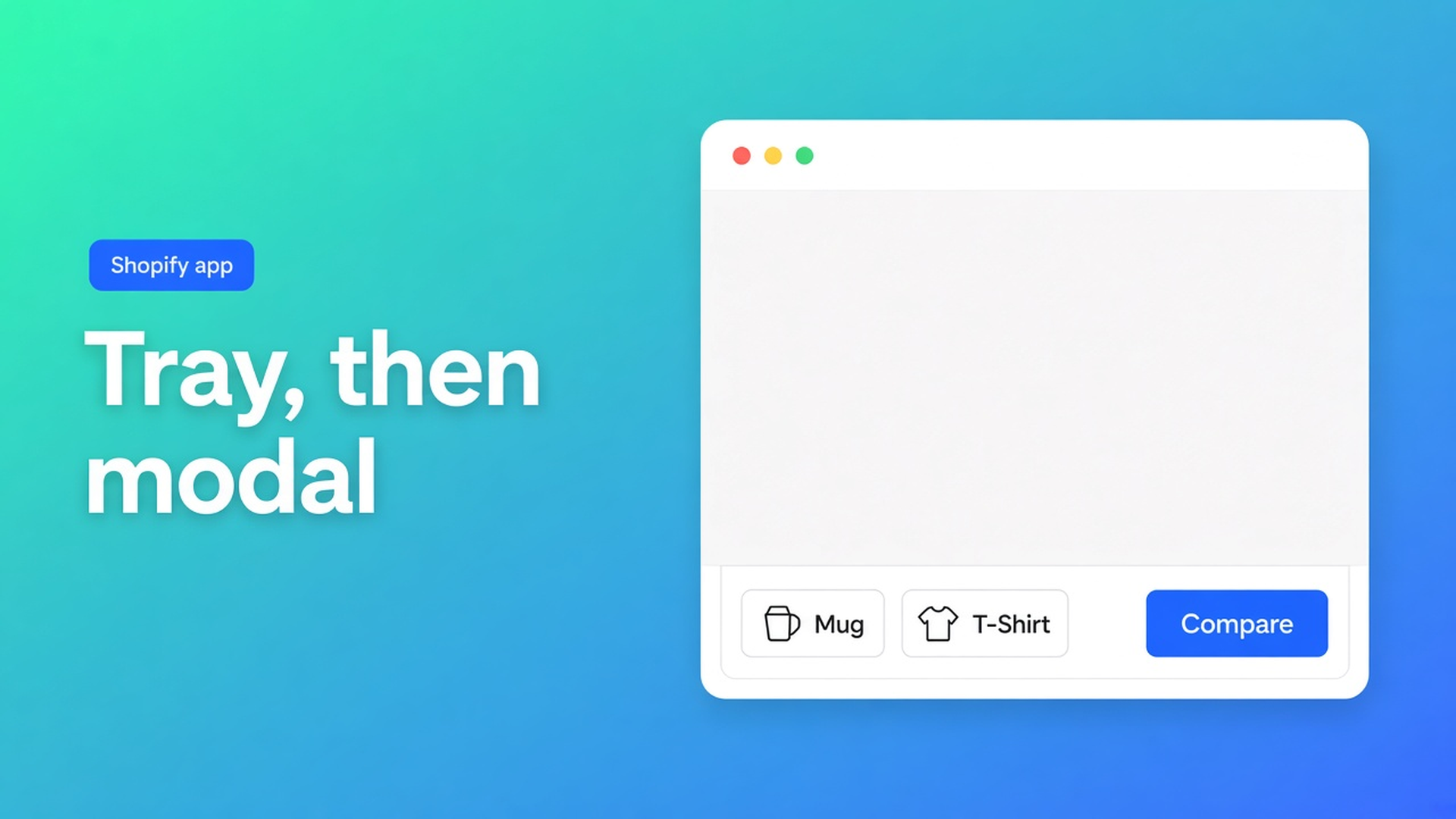
Shopify product compare tray and modal: keep the shortlist
The shopper pins the mesh chair, opens the leather one, pins that too, and wants columns now — not a bookmark labelled “Compare our range”. Searching Shopify product compare tray and modal is a search for those two layers: a bar that remembers the shortlist, and an overlay whose rows come from the products.
Native Shopify gives you collection cards and search. It does not keep Mesh + Leather until a modal opens. OO - Advanced Table Builder is the comparison type; the app embed is the tray/modal runtime. Theme blocks alone will not do it.
Attribute rows live in Shopify product comparison table. The product page is block versus inject. Collection cards are where Add to compare can start. This article is the chrome.
A Compare button without the embed is a dead click
Enable the app embed: Theme settings → App embeds → Tables, Specs & Comparisons. That embed powers shortcodes, the comparison runtime, Compare under the price, and size-chart placement above Add to cart when no Size chart block is present.
Drop a Compare button block and leave the embed off: no tray, no modal. Docs are explicit — blocks are not enough for tray/modal.
Auto-placement for Comparison: if the Compare block is missing, each comparison table may opt in to inject Add to compare under the price (Settings → comparison placement). The tray and modal still come from the embed. Specs have no ATC inject; they need the Product specs block. Tabbed and Us vs Them: always pick the specific table in the block.
What merchants ship until nobody shortlists two SKUs
A page of five screenshots. Static. Lumbar specs change; the PNG does not. No tray. Five tabs.
A metafield “compare with” as plain text. Readable. Not a second live column.
Us vs Them dressed up as a comparer. Fixed “us / them” columns. Shoppers do not pick two SKUs. Leave the comparison tray off that type.
None of that is: Add to compare → tray fills → modal with live cells.
Tray and modal are Design chrome, not a second table
Comparison table: add attribute modules (Weight, Price, options, custom attributes). Group under headings if it helps. “Product 1 / Product 2” labels are admin preview only. The storefront fills cells from each selected product. Do not hard-code per-product values on live rows.
Design for Comparison:
Layouts: grid, cards, or spotlight
Modal and tray styling
Add to compare button appearance
Chrome (popup, tray, tabs) lives in Design. Refine with AI on Design is allowed: description, screenshot, or a website URL for brand colors/fonts. Structure stays until you confirm. The type stays Comparison.
Customer-facing strings — trigger text, empty state, labels — translate per locale in Settings. Skip DE and a German shopper sees EN chrome on an otherwise German checkout.
OO - Advanced Table Builder is Free (5.0, 1 review). Listing: size charts, specs, comparison tables, AI, visual builder, fully translatable. Works with Excel / Google Sheets / AI. No paid tier. Older docs still say Tables, Specs & Comparisons; the CTA is this listing.
Worked example: three task chairs, tray at the bottom
Products Mesh, Leather, Stool. Comparison table “Task chairs”: rows Weight, Price, recline (metafield), base (option). No cell that says “Leather = 18 kg” by hand.
App embed on. Product template: Compare block or inject under the price. Collection: Compare block on the cards so Add to compare can start in the grid.
Test: pin Mesh. Tray appears. Pin Leather. Open the modal. Two columns, live values. Switch locale DE: translated labels. Add Stool as a third. Do not expect a Specs table next to Add to cart — that stays its own block.
Visibility in Settings: only the chair products. A desk lamp in the same collection does not belong on this tray.
An empty tray is not a bug. With no selection the chrome shows an empty state — translate that string too. On mobile the tray stays at the bottom; the modal keeps the same rows, narrower. Test both viewports. A button that sits under the price on desktop can vanish on a stacked theme next to the gallery: then a Compare block on a predictable slot wins.
Modal opens, cells blank: leftover hardcoded preview, or modules that do not hit a Shopify field. Weight/Price/Color should be Shopify-backed modules, not custom attributes you forgot to review after AI. Visibility too tight: Leather is outside the table rules, so the tray will not accept it. Embed off after a theme duplicate: the button survives, the runtime does not.
Ship the runtime, not a PNG
Install the app. Free, 5.0 (1).
New Comparison table. Attribute modules, no hardcoded cells. Enable + visibility.
Design: layout + tray/modal + button. Optional Refine with AI on Design.
Theme settings → App embeds → Tables, Specs & Comparisons. Save.
Compare block and/or inject under the price. Collection cards if you want the shortlist to start there.
Storefront: two products in the tray, modal, locale check. Embed off = stop test: tray gone.
A shortcode `[oo-table id=…]` can sit on a page if the embed is on and the table is enabled. The runtime is still the same tray/modal.
Close
A Shopify product compare tray and modal is not a screenshot in the menu. It is Add to compare, a tray that holds the shortlist, and a modal whose rows the products fill. Native Shopify stops at cards. The embed is the runtime; the Compare block or the inject is only the button.
Turn embed + comparison type on in OO - Advanced Table Builder. Shoppers then compare two SKUs in one overlay — not in five tabs.

The Shopify Select partner for ambitious e-commerce businesses that want to grow!


Services
Reviews
5/5
Mail: info@onlineorigins.nl
Tel: 073 234 0612
KVK: 89825624
BTW: NL865123639B01
Bruistensingel 500,5232 AH 's-Hertogenbosch Cookies
© 2026 Online Origins