
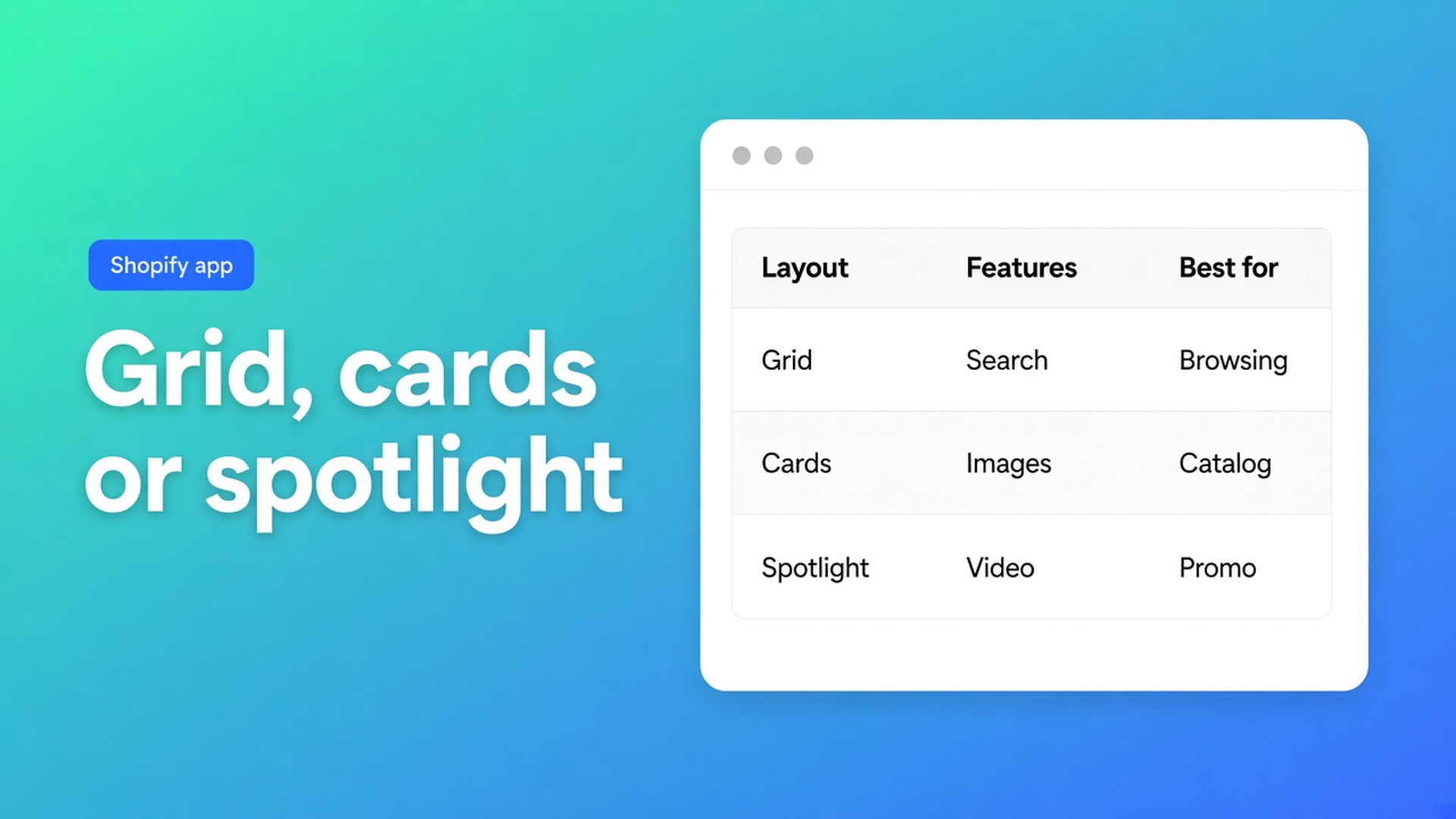
Shopify comparison table layout: grid, cards, or spotlight
The modal already holds Hybrid, Foam, and Latex. Rows for firmness, height, and price are live. It still looks like an exported spreadsheet, or like three posters nobody can scan. That is not a Structure bug. Shopify comparison table layout is the Design step: grid, cards, or spotlight. You are picking how the overlay draws. You are not picking which products the shopper compared.
OO - Advanced Table Builder (docs still say Tables, Specs & Comparisons in places) lists that under Comparison table: layouts such as grid, cards, or spotlight, plus modal, tray, and Add to compare styling. Listing 5 Nov 2026: Free, 5.0 from 1 review.
Related: the tray and modal and the product-page button. Yesterday: import and export. Stay on Design. Do not pitch another app.
Layout is paint. The picker is elsewhere.
Shopify does not keep Hybrid + Foam in memory until an overlay opens. Collection cards exist. A live attribute matrix does not. You add modules in Structure (Weight, Price, options, custom attributes). The storefront fills each cell from the selected product. “Product 1 / Product 2” labels are admin preview only.
Docs: do not hard-code per-product cells on live comparison rows. Switching from grid to spotlight does not change that rule. Same metafields. Same shopper selection.
Design settings overview by type:
Size charts — popup vs plain, trigger, colours
Product Specs — details panel, classic, cards, …
Comparison — grid/cards/spotlight, modal and tray, Add button
Tabbed — tab chrome
Us vs Them — highlight templates
Specs templates are not comparison layouts. Us vs Them is a different type (you versus a generic “them”, no live picker). Do not convert Comparison because spotlight “feels more winning”.
Add to compare and the tray still come from the theme block or the app embed. Auto-inject under the price when the Compare block is missing: Comparison placement. Specs still have no inject next to Add to cart.
Mistakes that treat Design as Structure
Changing layout so Hybrid “shows up by itself”
Shoppers pick products. You pick how the modal paints columns. Spotlight will not fill an empty tray. Without the embed there is no tray, grid or otherwise.
Typing Pro’s wattage into Design “so it looks finished”
Live rows are not a poster. Put Weight and Price on Shopify modules in Structure. Design is colours, fonts, spacing, chrome. Refine with AI on Design merges styling after you confirm — description, screenshot, or a URL for brand colours. Type stays locked.
Reusing size-chart popup styling on a comparison
Popup versus plain belongs to size charts. Comparison chrome is modal and tray. A size-chart screenshot as a Design reference gives you the wrong chrome.
Styling Add to compare while the button is not in the DOM
Button appearance exists. Place the block or turn on auto-inject first, embed on. Then colour the control. A mint button that never renders helps no one.
None of that replaces live Structure rows, an embed for tray/modal, and Design for look only.
Three named layouts, one shortlist
Docs name grid, cards, or spotlight. Do not invent a fourth. Change it on one table. Do not clone three Comparison tables to A/B the look.
Without inventing UI chrome the docs never draw:
Grid when shoppers must scan many attribute rows across columns (weight, wattage, warranty).
Cards when the line is short and each SKU can sit as a block instead of a spreadsheet.
Spotlight when one product may lead the modal — still the same live rows, still not Us vs Them.
The shopper on Hybrid pins Foam. The tray keeps that. The modal opens in whatever layout you saved. Flip grid to cards: Hybrid and Foam stay selected. Only the drawing changes.
Colours and fonts: Design, or Refine with AI from a brand URL. Structure stays. Listing: visual builder, AI draft from description or screenshot, metafields, per-locale translation.
Worked example: three mattresses, one switch
Shop “Night & Needle” compares Hybrid, Foam, Latex. Structure: Price, Height, firmness (metafield), options. Embed on. Compare block on Default product. Show on product cards on.
First ship: grid. Desktop was fine. Retail partners said the third column became a sheet on a phone. No second table. Design → cards. Same rows, same metafields. Tray untouched.
Second complaint: Hybrid “vanished after the layout change”. Hybrid was Draft. Layout does not remove SKUs. Status does — the product is no longer a live cell source. Set Hybrid Active; cards or grid is irrelevant.
They tried spotlight so “Foam is the hero”. That is comparison-modal chrome, not an Us vs Them column against a fictional competitor. Different table type.
Test: two products in the tray, open the modal, switch layout, open again. If the shortlist dies, you have an embed/runtime issue, not a Design issue.
Ship it
Install OO - Advanced Table Builder. Free.
Type Comparison. Structure: modules, no hardcoded cells.
Theme: app embed on. Compare block or auto-inject under the price.
Design: pick grid, cards, or spotlight. Style modal, tray, button.
Optional Refine with AI on Design. Confirm.
Enable the table. Test the product page and collection cards if you turned those on.
Settings: visibility and product rules. Translate button copy and empty states per locale. Import/export is a backup of structure — yesterday’s topic, not this one.
Wrap
Shopify comparison table layout is Design: grid, cards, or spotlight, plus modal, tray, and button chrome. Not the catalogue. Not which SKUs the shopper pinned. Structure fills rows from live products. The embed runs tray and modal. Specs do not inject beside Add to cart.
Pick the layout in OO - Advanced Table Builder after Hybrid and Foam can actually reach the tray. Runtime first, paint second.

The Shopify Select partner for ambitious e-commerce businesses that want to grow!


Services
Reviews
5/5
Mail: info@onlineorigins.nl
Tel: 073 234 0612
KVK: 89825624
BTW: NL865123639B01
Bruistensingel 500,5232 AH 's-Hertogenbosch Cookies
© 2026 Online Origins